Cover of Imprint with Eatock’s Holley Portrait, made by a verbal self-description laid out to follow the lines of his thumbprint. Each copy of the book is marked with Eatock’s autograph thumbprint on the spine. He invites others to make Holley Portraits and posts them on his website.
Daniel Eatock; Extra Medium at Arcadia University Art Gallery (through Oct. 26, 2008)
Daniel Eatock Imprint (Princeton Architectural Press, ISBN 978-1-56898-788-0)
I remember Charles Eames’ description of how designs were generated in Eero Saarinen’s workshop: in response to the brief, they came up with ten solutions; then ten variations on each solution; then ten variations on each of the variations,… and so on. The process was structured to yield the perfect solution. Daniel Eatock prefers the accidental, scavenged and contingent to the perfect solution. The young, London-based designer creates exercises that generate designs, some of which involve input from strangers: make a frame with the same surface area as the image it surrounds; position felt-tip pens vertically against a stack of paper to see how many sheets the ink reaches before the pens are empty; use the web to solicit photographs that include the camera’s strap in the image (all of which can be seen in the Arcadia University Art Gallery exhibition). Never mind that some of his methods have been used before; an artist/designer is allowed to borrow, steal and adaptively reuse the ideas of others. What matters is where he takes them.
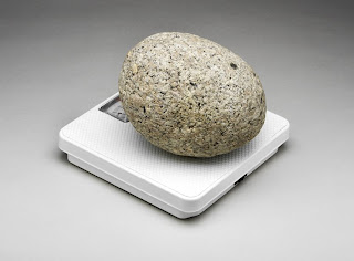
Daniel Eatock One Stone (2004)
Eatock enjoys contrarian solutions. He has a particular fondness for visual rhymes (a man in a red jacket walking past a red car stopped in front of a red sign…), for visual/verbal puns (a photograph of two pears titled A Pear), and for humorously literal interpretations of common expressions, such as finding a stone that weighs exactly one stone (a British unit of weight equaling 14 pounds). Eatock would like my friend, Marge; she shelves her books according to the colors of their spines: red books, yellow books, white books,… ; and David, my best friend in high school: whenever he drove up to a yield sign he would point it out and look at me suggestively.
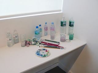
The circle is Eatock’s favorite form. He draws circles free-hand (he drew one to be bound into each copy of Imprint), and sets up projects with looping relationships, such as Mineral Watercolor Paintings, where the content of the bottles is used to create their depiction, or Scissors (and Nippers) that Need Scissors (or Nippers) to Be Opened ( described as examples of a burgeoning collection that enact a form of circular, if not familiar frustration induced by the conflicting imperatives of consumer packaging and product safety). Both are included in Extra Medium.
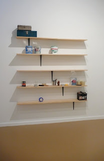
Daniel Eatock Do Not Touch Shelves (2008) counterbalanced shelves attached to the wall with a single bracket .
Eatock says his aim is to reduce subjectivity in design, but this is another case where I’d rather look at what he does than says. Nothing is as subjective as humor, a trait which runs throughout his work. And then the inevitable choices: size? He based his monograph on the dimensions of A4 paper (the European standard, as 8 ½ x 11 inches is standard in the U.S.); typeface? I’d have expected Helvetica, the lingua-Franca of modernist design, but in fact Eatock chose a subtly different font, still sans serif and not entirely easy to read. Imprint reads a bit like a the usual artist’s monograph in scrapbook form crossed with a handbook for how to see the world differently. You know it’s beyond the ordinary by the Contents page which is something closer to an index: an alphabetical list of words from Accidents to Wit including Gaps, Punch Lines, and Upside Down. Indeed the book covers the entire list (Balance, Car Batteries, Digressions, Elephants, Fingernails…) even if Eatock doesn’t bother with conventional page references. A significant number of the illustrations weren’t even done by the designer but were responses to projects solicited on the web.
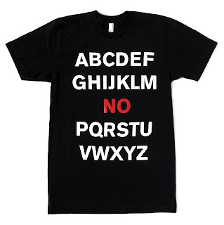
Daniel Eatock Tee Shirt made to benefit the International Dyslexia Association (2007)
The participatory aspect of Eatock’s work runs through Extra Medium, his first U.S. exhibition. One student executed Mineral Water Color Wall Paintings, a group of students contributed Holley Portraits, the photographs in Camera Strap/Frame were taken by strangers who submitted them to Eatock’s website (www.eatock.com), and visitors are invited to write their names in a guestbook using a space pen affixed to the counter, a project called Fixed Pen/Signature Book; to contribute to his web piece One-Mile Scroll; and to bring objects with expiration dates of October 26, 2008, when the exhibition ends (Best Before October 26, 2008). Communal exploration and play pervade his practice, as does his generosity. Both book and exhibition are invitations to join the designer in finding humor and patterns in the everyday by looking at the world from a slightly different angle.


