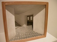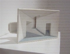
Untitled, masonite, wood, Plexiglas and acrylic paint, 4 x 6 1/4 x 3 inches
Just one of Lynne Clibanoff’s five little house shadow boxes at Gallery Joe reminded me of the humongo Holiday Home by Ben van Berkel and Caroline Bos (UN Studio, Amsterdam) (see Roberta’s Flickr site for Holiday Home images). But the idea that Clibanoff’s version was the toy version and the Bos-Van Berkel was the real-world version struck me as so funny that I’m having trouble letting it go.
Not that it’s all wrong. The Clibanoff piece that most calls up the comparison, Untitled, has unexpected angles and pods jutting out unexpectedly. And works create a special atmosphere using architecture.
But like all of Clibanoff’s pieces, Untitled’s atmosphere is calm and empty, a peep into a space missing its people. Holiday Home, on the other hand, because you walk in, is not empty, and has a fun-house atmosphere, with its pink walls and vertiginous, swooping planes. Holiday Home is full of jokes–the picture windows that don’t know what a right angle is, the floor that rises up under your feet, the chimney that has no real fireplace, etc. The jokes in Untitled are not really lol funny, except perhaps for the little ball support in the back (to see an image of this and more of the show at Gallery Joe, see my Flickr set here).
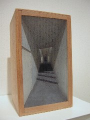
cigar box, masonite, Plexiglas and acrylic paint, 7 1/2 x 4 3/8 x 4 1/4 inches
Clibanoff’s little structures have gloomy recesses, in some cases the gloom emphasized by a subtle shading of graphite on the edges of the walls. There’s something Surreal going on here. This dreamscape is not about wish fulfillment at the level of cotton candy. It’s about desire in the context of isolation, emptiness and shadow, and it’s about hope coming from the light in the windows. But mostly it’s about not being able to get in.
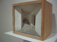
Cabinet 57, cigar box, masonite, Plexiglas, gesso and graphite, 7 1/2 x 4 3/8 x 4 1/4 inches
Part of the charm, here, is 2-D perspective applied to a 3-D space. It reminds me of a stage, with it’s upstage and downstage tilt of the floor surrounded by the proscenium. But for all the staginess, the little boxes, with their details and their attention to light and dark, are not about acting. They are more about the mise en scene of where other people’s lives are really lived, with disappointments and a sense of limits. By changing the perspective, Clibanoff achieves a spatial and emotional compression in a world where the stability of rectilinear architecture is undermined.
I especially loved Cabinet #57, with the tilting black and white tiled floor. The perspective of the tiles clearly shouts how false the perspective of these pieces is.
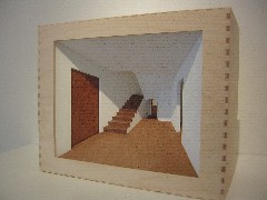
Center Hall, plywood, masonite, Plixglas and acrylic paint, 10 3/4 x 13 1/4 x 6 3/4 inches
That announcement of the falseness of perspective also applies in Center Hall, in which the hallway in a little house with a blind doorway, blocked by wood. That thought is even more pronounced in Cabinet 56, in which the hallway ends into a vanishing point. In the real world, the vanishing point is only a trick of the eye. Move closer and it moves back further. But in this little cabinet, the end is real.
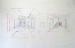
Plan for Center Hall, graphite and colored pencil on mylar
Another highlight was the drawings for the cabinets, working plans that show the complexity of the process by which they are made. The drawings serve as templates for cutting the parts, and show how the fitting together will work. They are spectacular for their information about process, as well as their meticulousness and their difficulty.
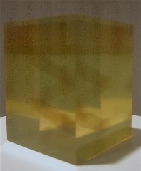
Tower, by Cheryl Goldsleger, 6 x 5 x 5 inches
Also showing at Gallery Joe are two architecture-inspired sculptures and seven graphite on mylar drawings by Cheryl Goldsleger. The sculptures, two amber-colored blocks of epoxy acrylate that look like jello, contain elusive 3-D drawings of spaces–a stairwell and an arcade.
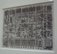
Migrate, by Goldsleger, has elements that represent the original plans for Detroit; 6 1/8 x 7 15/16 inches
The drawings, which have a nice, grainy texture and a slight messiness to relieve the control of the lines, suggest buildings and aerial perspectives of city plans. Indeed, they are inspired by some old, original plans. There’s a suggestion of times past and the importance of imagined light in both of Goldsleger’s bodies of work. Although I liked looking at them and even admired them, the pieces seemed to reach to retrieve and revivify ancient meanings lost in time.


