There’s an extraordinary opportunity, in Washington, D.C. at the moment, to study major paintings by Mark Rothko in three museums with varying lighting conditions.
Some artists are particularly concerned with how their work is lit, and Mark Rothko was one of them. As Tom Hess told the story, Phillip Guston remembers the time when he and Rothko went to see the installation of one of Rothko’s shows at Janis. They strolled into the gallery and Mark, without a word, switched off half the lights. When Janis emerged from his office, the three of them chatted a bit and, in a pause in the conversation, Janis slid off and turned all the lights back on. Rothko didn’t say anything. They finished their visit; Janis went back to work, Guston and Rothko waited for the elevator, and just before they entered it, Rothko turned half the lights off again. ‘I’m positive’ Guston says, ‘that Mark sneaked up there every day and turned the lights down – ….’
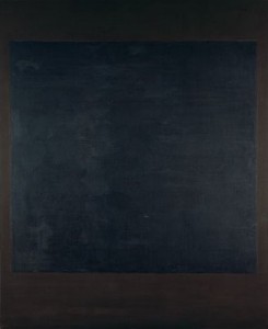
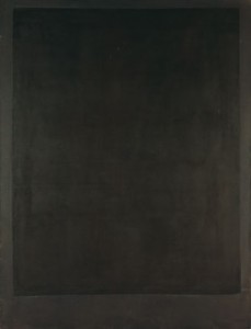
Seven from the series of more than a dozen black paintings Rothko produced in 1964 are on display at the National Gallery of Art’s (NGA) In the Tower: Mark Rothko, through Jan. 2, 2011. They were never shown during the artist’s lifetime and this is the first exhibition to focus on them. In the hallway leading from the elevator are seven earlier works in which Rothko used black, and a short, introductory video narrated by Harry Cooper, the exhibition’s curator. None are from Rothko’s best known paintings of the 1950s, which employ floating rectangles of deeply-saturated colors; he used little black during that period.
Rothko had been commissioned to make two series of paintings before these: one for Harvard University in 1961-63 (now ruinously faded because of long exposure to un-filtered light, and un-exhibitable), another for The Four Seasons restaurant (1958-59), now at Tate, London. After completing the black paintings he fulfilled another commission, by Dominique de Menil, for a chapel in Houston; these were also dark monochromes. The chapel was completed in 1971, after the artist’s death.
The arrangement of the black paintings at the NGA, on three walls of the Tower Gallery, inevitably evokes the canvases that cover the walls of the octagonal chapel in Houston, known as the Rothko Chapel. Benches have been provided, making it easy for visitors to linger, and the curator has taken the unusual step of playing music: the work commissioned from Rothko’s friend, Morton Feldman, for the opening of the Rothko Chapel.
The most stunning aspect of the installation is the natural lighting from skylights (supplemented with artificial light, depending on weather conditions, although I visited on a rainy day and they were not turned on). Almost all painters prefer their work be seen in sunlight and very few museums are able or willing to provide it, often for reasons of conservation; it’s harder to control than artificial lighting. At his exhibition in 1961 at the Whitechapel Art Gallery, London, Rothko had the lights turned off and the paintings shown entirely in natural light.
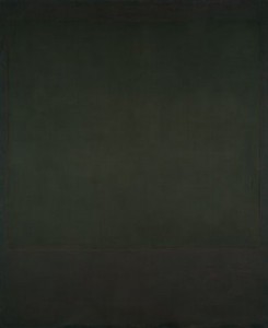
For paintings with such subtle surface incident and narrow tonal range, the lighting is crucial. Rothko varied the surface quality and sheen of his paints, some of which he mixed himself, often combining media; he also avoided varnish, which would have hidden these distinctions. The National Gallery of Art identifies most of the black paintings as mixed media, and the central forms are consistently less matte than their surroundings. Rothko always emphasized the hand-made quality of his paintings, the record of brush against canvas (and made it clear that this distinguished his work from the un-inflected, pristine surfaces of Ad Reinhardt, who’d been making velvet-y, black monochromes since 1952).
These are paintings that have to be experienced; reproductions convey very little. Rothko’s compressed imagery demands not only proper lighting but also a viewer willing to move, so as to catch the surfaces from multiple angles. Serious attention reveals that the paintings are not properly black at all. From a sharp angle some appear dark brown but at a close distance reveal themselves to be various shades of purple, some of which incline towards red; the untitled painting has a wine red central field. At a distance I was unable to distinguish the central fields from their surrounds in several of the paintings. This hard looking was hard work. At some point I found myself wondering why paint on canvas should matter so much; a thought that recurs from time to time. I’ll have to accept the historical explanation that within our cultural tradition, paint on canvas is the visual form where we manifest our most serious ideas. That may not be the case in 2010, but was still plausible for an artist of Rothko’s generation.
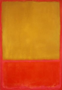
The week after looking at the Rothkos in the NGA I found myself in the Corcoran Gallery of Art’s Modern and Contemporary Art Since 1945 gallery, where I came upon Rothko’s Mulbery and Brown (1958), a painting so seductive I wanted to lick the surface (the museum was unwilling to provide an image, I’m sorry to say). The medium was listed as pigmented hide glue, egg and oil, and the surface had the sort of soft, pigment-saturated quality that Rothko sought with his home-made combinations of media. The gallery, once again, was sky lit, with the addition of incandescent floods. This made me wonder about the famous Rothko Room at the Phillips, so I jumped in a cab to Dupont Circle.
The Phillips Collection opened the first room in a museum devoted to Rothko’s work in 1960. As the museum describes it: Rothko himself took a close interest in the room, which inspired similar Rothko installations elsewhere. On one visit in 1961 when Duncan Phillips was away, he asked the museum staff to make several small adjustments to the space. Phillips immediately noticed—and reversed—the changes when he returned. He did agree, however, to limit the seating in the room to a single bench, a decision that is still honored today.
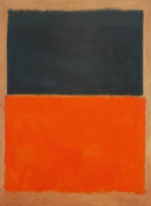
The Phillips also mentions that the room was relocated within the museum in 2006 and I can only surmise that the lighting was altered. The small, vertical window in the room casts no direct light on the paintings, which are illuminated by incandescent lights. These are so close to the paintings, in the low-ceilinged space, that the lighting is much stronger at the tops of the canvases than at the bottoms. One of the paintings, Green and Tangerine on Red, has also been varnished.
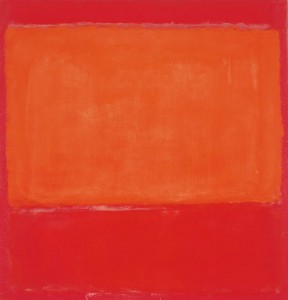
The Rothko Room is still a unique opportunity to be surrounded by the artist’s work in such proximity that the paintings become the environment, rather than distinct fields upon a wall. But to see Rothko’s work at its best as well as to sensitize one’s eye to the powerful effects of lighting, it’s worth going to the NGA and the Corcoran while these examples are on view.


