[Kelly shares how a show highlighting a traditionally two-dimensional medium succeeds in representing the multi-dimensionality of city life and landscapes. — the Artblog editors]
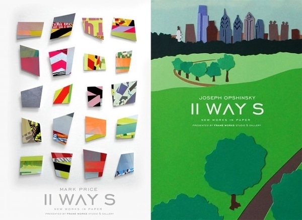
II Ways, Mark Price and Joseph Opshinsky’s celebration of all things urban at Frameworks Gallery, uses vibrantly colored cut paper in abstract and representational motifs to depict the energy, sharp angles, and scenery of Philadelphia.
In the two-person show, cut paper–fragile and pristine–is a surprising choice for the subject of metropolis, but it works.
Masters of their medium
Price’s pieces are abstract and geometric, full of hard edges and hints of urban visual and verbal vocabulary. Also intricately cut from paper, but otherwise dissimilar, Opshinsky’s pieces are graphic line drawings organically cut and collaged into flat city images.

The artists’ cut paper art is anything but elementary school busywork. Paper never seemed so easily wrestled into form. Both artists have a talent for urging the easily bungled medium to do precisely what they envision–in fact, from afar, neither artist’s work looks like paper. Opshinsky’s pieces remind me of expressive paint-by-number images, and Price’s could be computer-rendered for their perfection.
Because it must take time and focus to create these paper images, each is imbued with a meditative quality. I envision Price spending hours screen-printing and piecing together one work, all the while contemplating the title, whittling down a train of thought into just a few precise words that carry the the work’s meaning.
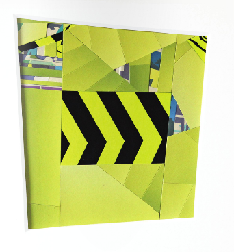
Price’s titles add a deeper meaning to his abstract pieces. His words are as much a part of his art as paper. Rather than just being impressed with Price’s precision and the depth of his screen prints, upon seeing each work’s title, we begin to create a story for it. The titles in this show (“Freely Available”; “From Smart to Intrusive”; “Remember, Correlate, Anticipate”; “Fractured Cautionary Sign”; “Falsified Experience”; and “Distinct Zones”) are a far cry from “Untitled” or “Red Number One”.
Perhaps it’s the combination of Price’s work with Opshinsky’s, but these terms, and the collages’ remotely familiar shards of–is that a billboard? A shadow? A peeling poster?–made me reflect on city life. Although the works are very precise and hard-edged, nothing is square. I was left feeling slightly off-balance–as if I were viewing snippets of images jumbled together, the view from a moving trolley window.
Detailed depictions
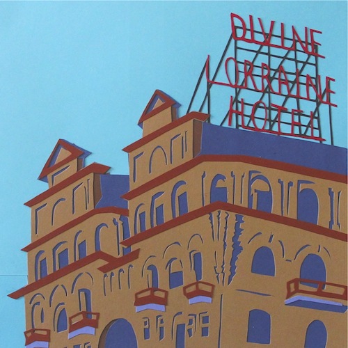
Opshinsky’s Philadelphia A-Z celebrates 26 often-seen, sometimes overlooked landmarks in Philadelphia. Like Price’s work, Opshinsky’s also incorporates a meditative quality. Attention to small things, like a reflection in a puddle, seem to elevate the beauty of aspects of life we often overlook. His hand-cut, free-form lines offer respect to each minute detail of the subject he captures.

Reflections of the city street on the gallery’s glass-framed works slightly distracted me, but slightly enhanced the works’ metropolitan focus. Stepping outside the gallery, my vision changed. I now notice details of buildings and signs that I missed when I entered. Everything seems handmade, each detail important…from the letters on signs to the geometric edges of 20-story steel-and-glass buildings. Paper has never looked so intricate or precise.
Not discussed but also incredible are Opshinsky’s larger paper-cut images: “House Side,” “Laceworks Clock Tower,” and “Trolley”.
Joseph Opshinsky and Mark Price, II Ways: New Works in Paper, is on view at Frameworks Gallery, 2103 Walnut St., Philadelphia, PA through August 10, 2014.


