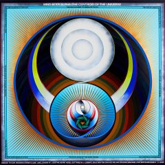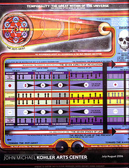
Paul Laffoley’s Temporality, from the Kohler Art Center exhibit Utopia. This is a scan of Kohler’s brochure of the show and it was too big for the scan bed so the right edge is cut off–sorry.
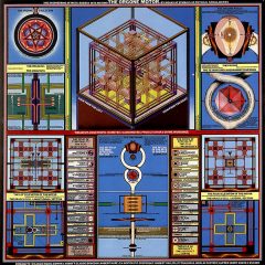
I knew when I saw Paul Laffoley’s paintings in the group show Utopia at Kohler Art Center that they rang a bell. (See post) I had seen similar, systemic, poster-like works in my own home! Steve had brought home a number of DARPA (Defense Research and Planning) posters a while back. And by George (pun intended) aren’t Laffoley’s works and the DARPA poster similar in color, line, word content and design.
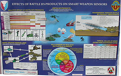
Effects of Battle By-Products poster from DARPA
Of course that’s all they have in common–the architecture of the designs and the pedagogical intent. Laffoley, a visionary, is making works that are pacific in their intent and internally driven. It’s art, after all. The DARPA poster presupposes the dystopia of battle and suggests a how to understand the fallout from what you’ve done.

here.
Laffoley may never have seen this type of poster (and presumably he didn’t) unless he was in the army, which I didn’t see listed on his resume (link above goes to his resume). And certainly the people who made the DARPA poster don’t know about Laffoley’s art. But they clearly speak the same language of graphic design.
There’s something universal and human about diagramming a story to communicate a lesson. I guess humans since the Lascaux caves have been using visual storyboards to communicate. The messages are all different but the system seems to work fine.


