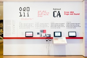
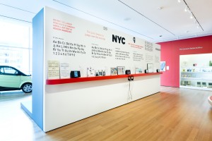
The clearest possible introduction to the thinking behind new typefaces is part of a larger exhibition, Standard Deviations: Types and Families in Contemporary Design, at the Museum of Modern Art, New York (through January 30, 2012), but the typography section works perfectly well on its own. Featuring the recent acquisition of twenty-three digital typefaces – a first for MoMA’s design department – this sub-section of the exhibition is the most lucid and informative introduction to design thinking I’ve seen at the museum. It’s an introduction to typography primarily for readers, rather than designers.
The installation itself is stunning, functional, and user-friendly: a narrow, red shelf at chest height with all the information above, so it can easily be read by standing adults (in contrast to the unfortunate recent trend to position text-filled labels at a height legible to visitors in wheelchairs and grade-school children, but no one else). The exhibition consists of typeface examples on the walls, some printed material in small, cantilevered, flat cases, and small television screens, some of which have headphones for sound.
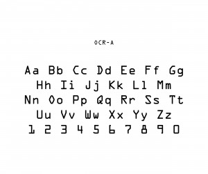
All the typefaces were created on computer screens, although most were designed to be used for print on paper. Indeed, the varied role of computers is a leitmotif of the exhibition. OCRA-A, familiar from the numbering on bank checks, was designed to be readable by computers and conforms to specifications of the U.S. Bureau of Standards. All previous type was designed to be read by the eye, whereas OCR-A was designed to account for the optical scanner’s difficulty in distinguishing Os from zeros or Qs.
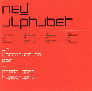
Wim Crouwel’s New Alphabet (1967), on the other hand, was designed to be legible on the computer screen, taking account of the difficulty of producing diagonal and curved lines on digital screens. It yields the block-y letters seen on many digital clocks and signs.
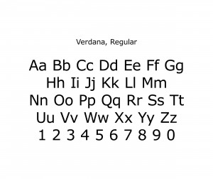
Verdana, designed by Matthew Carter, was also intended for use on the computer screen. It counters the tendency for negative spaces in letters to fill in and for some characters to be hard distinguish, such as the number one, the small letter l, and the capital I.
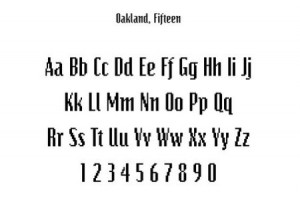
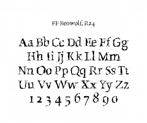
Zuzana Liko designed Oakland (1985), a bitmap typeface, exclusively on a Mac, which revolutionized typography, although high-resolution computer screens eventually eliminated the need for it. Walker, commissioned by the Walker Art Center, Minneapolis from Matthew Carter in 1995, is a mutable, interactive typeface, which is only possible with computer technology. The computer’s unique ability to generate a randomization command is integral to Erik van Blokland’s and Just van Rossum’s typeface, FF Beowolf (1990) which, in its lively irregularity, has some of the personal element of handwriting. They discussed their reasoning for a design which worked against industrial perfection in the wonderfully-titled article, Is best really better?
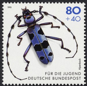
Several typefaces responded to the very specific demands of their users. Erik Spiekerman designed FF Meta in 1984 for the German Post Office, which needed a type that would work equally on the scale of postage stamps and the sides of postal trucks. Mercury (1999) was Jonathan Hoefler’s answer to the New York Times’ need for a typeface that could be used in differing climates across the U.S., since newsprint absorbs ink differently in dry and humid environments. The solution was a design that could be tailored to the locale, but maintain the same letter width so the layout could be standard.

This exhibition brings back some of the focus on letter forms that most of us only experienced in first grade, when we learned to create glyphs that opened up a new means of communication. It makes me wonder whether, in the emphasis in education on testable content, handwriting itself will become obsolete.


