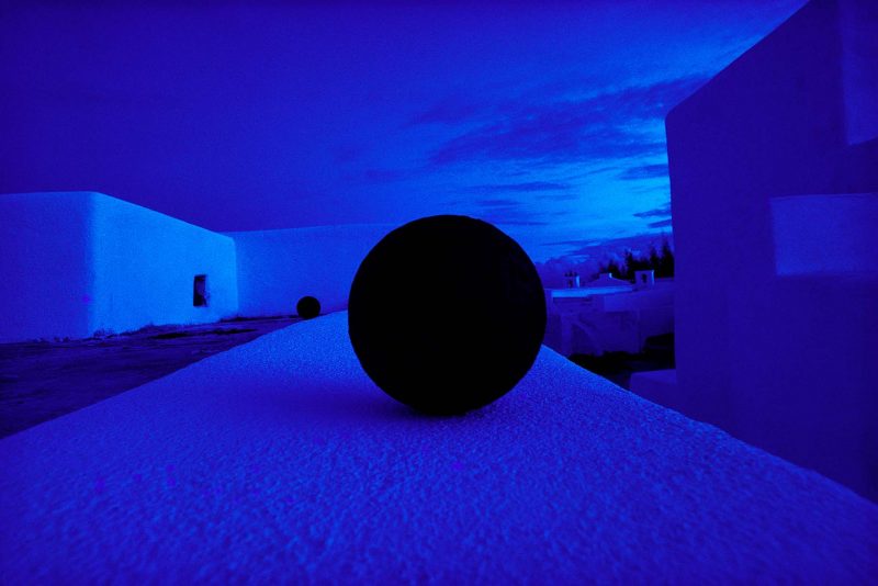
In 1970 I was decidedly a rock-n-roll guy. My idea of jazz was Greg Rolie’s solo break in Santana’s “Treat,” or Ian Anderson bopping out on Bouré. So, when my college girlfriend showed up with a copy of Hubert Laws’ Afro Classic, it was the cover that caught my attention. A shiny gatefold opened to reveal an extreme wide-angle photo of white-washed walls receding into the distance with what appeared to be a cannon ball at the very center of the image. Apparently illuminated by moonlight, the image was so suffused with blue that it seemed to glow on its own. The cannon ball, a shadowless black circle, was like a hole through the picture, ready to suck its surroundings in. The photographer was Pete Turner, whose work had already graced dozens of albums by this time and would go on to provide the distinctive look of the CTI (Creed Taylor Incorporated) jazz label. Pretty soon, I found his work everywhere.

Throughout the 1960’s and ‘1970’s his austere and brilliantly crafted color images made him a darling of the Madmen commercial sphere and helped him cross over into the holdings of museums throughout the world. A graduate of RIT, in the same class as Jerry Uelsmann, he was a major player right out of the gate. He mastered the newest color darkroom techniques of the early 1960’s while in the army and learned to manipulate color in ways that were unlike any other practitioners of the time. His prints and archives are held by the George Eastman House, in Rochester. He has work in the collection of the Metropolitan Museum of Art. He operated two studios in New York City and worked for every major magazine. Even more than his contemporary, Ernst Haas, his name was synonymous with the artistic use of color.
But one institution eluded him: the Museum of Modern Art’s Department of Photography under John Szarkowski, having largely avoided color work, chose another horse to ride in William Eggleston, whose work they exhibited and published in 1976. Szarkowski’s preference for a more naturalistic form of the art bent the priorities of the museum to highly personal work derived from an editorial and documentary context and away from the commercial side that his predecessor Edward Steichen was more amenable to. The “Shark” became the dominant voice of modern photography through his brilliantly curated exhibits and masterful writing, and Eggleston, almost unknown prior to his “discovery” by MOMA became the highly controversial star of color art photography.
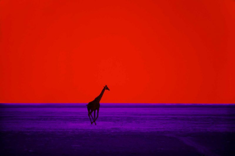
While much has been made of Eggleston’s use of the dye-transfer process, his approach was far simpler and more casual than Turner’s. Eggleston’s images were shot as Kodachrome slides and printed to sustain the saturation inherent in that medium. Turner shot on a variety of film stocks and heavily manipulated the images in a color darkroom. The results were striking but didn’t necessarily resemble the original scene, at times becoming almost pure abstractions (among his most famous images is a picture of a Giraffe silhouetted against a blood-red sky, galloping across a purple veldt.). Turner’s images invariably packed an immediate punch, making them ideal for advertising, college dorm-room posters and, yes, record album covers, while the images produced by Szarkowski’s favorites were typically dense, elliptical, and (except for photographers like Diane Arbus) unprepossessing.

The standard myth is that galleries and museums didn’t consider color photography to be art, but this is nonsense. “Artistic” color photography has been with us for much longer than has been suggested. The problem was that there wasn’t much of it. Color photography was extremely expensive and to do much of it, you needed institutional or commercial backing. Turner was underwritten by commercial and editorial clients from the very beginning of his career. Essentially, he and his clients saw eye-to-eye, his aesthetic a perfect match for the time, at least in terms of finding paying jobs. Eggleston was essentially a wealthy guy who could afford a lot of slide film and the occasional fancy printing job. His work slotted into the Szarkowski curatorial viewpoint much more neatly than Turner, and it was his work that came to define color photography in the 1970’s. With the ice broken by Eggleston, color work by Joel Meyerowitz, Saul Leiter, and many others reached museum walls. Photographers already famous, such as Garry Winogrand and Helen Levitt, turned out to have interesting, albeit tiny, color archives. As Szarkowski almost single-handedly pushed photography toward a less formal, more natural, and spontaneous mode of depiction, Turner’s elegant, nearly abstract imagery became increasingly confined to commercial work, and a slick type of travel photography. With the recently announced representation of Turner by the Bruce Silverstein Gallery in New York, it is probably time to re-evaluate the work of this — not exactly neglected– but now underrated photographer.


