Post from Sid Sachs

[Ed. –Sid is responding to my post of Nov. 4 on George Segal.]
OK Roberta, Tell me how in the world plaster is ugly? It just is. You may think the sculptures are ugly. You may not like how the work surface is built up or the environments composed. But ugly?
Are walls ugly because they are made of plaster? Is paper ugly? You then complain about the lack of color. That is not what Segal was about. Does bronze have a color? The white is the intrinsic color of Segal’s signature material and when he used color it often didn’t work well and seemed arbitrary.

Then you complain about his “lack of humor(!!!)” sic. I hope that was a joke.
You don’t go to Segal for humor — it isn’t there. Does everything have to be light, colorful, humorous?
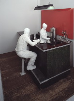
Would you go to Gorky for a laugh? Cornell? Kline? Rothko? Dostoevski? Hopper? And Hopper is the artist that most connects to Segal. (image above is Hopper’s “Western Motel,” image left is Segal’s “The Diner” (1964-66)) And the fact that Segal used plaster most of his career is just a fact.
If (Eva) Hesse had lived she probably would be using fiberglass, latex, and rope. Plaster was Segal’s signature as much as welded steel was Smith’s. Have you asked Sarah McEneaney to stop using tempera?
You are applying value judgments without deep criteria. 
And previously on November 1 you write [Ed.–actually it was Libby who wrote] of Clint Takeda “a poignant earnestness to a lot of these images…Takeda’s sculptures…have human boy souls peering out from their deformities”. I like Takeda’s work but it is “ugly” and that is positive here. (bottom image is a Takeda ink on paper drawing)
So when is the abject, ugly, deformed, gross, colorless, good? And when is it “plug-ugliness” (your words). –Sid


