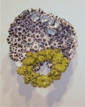
 By some harmonic convergence, the three artists at Fleisher‘s Challenge #1 exhibit talk to one another, partly thanks to the music of the spheres emanating from Sarah Zwerling’s installation, the paintings of the spheres in Steve Cope’s exhibit and the meltdown of the spheres in Veleta Vancza’s enameled copper.
I’m not stating this to be jokey. But two of the artists are pinging on some kind of outer limits, and Zwerling’s music implies that as well, although I’m not so sure that was her intent.
Veleta Vancza: Contradictions merge
The work I found most interesting were Veleta Vancza’s tiny (diameter 1 inch-ish) colander meshes gone wild. When I talked to Roberta, a couple of days ago, she said she thought that when they were glommed together, they looked like Rice Krispie treats. I was thinking caramel-coated popcorn.
The scientific process of fusing the little globs seems to have been a big part of what generated this work. If you’ve been reading me lately, you know I’m on a tear about the failure of process pieces to achieve completion, to rise above the methods to become statements. But here we have work that does the job.
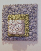 Side by side with the process is some formal and intellectual zing.
First, the bonding of the popcorn-shapes raises the seemingly contradictory issues of material strength versus delicacy. And then there are the references to enameled household products and to jewelry–the ordinary versus the precious.
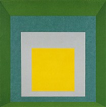 Add a layer of Modernism and formalist references to Josef Albers’ Homage to the Square series (right) and some Jasper Johns targets (below left) and go straight to Target to buy your Modernist refrigerator or droopy bowl.
This mixing of high art and low design strengthens this work as a final product, and that’s what interests me the most here. 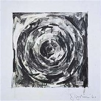 The “Homage to Form” (left above) takes Albers’ low-affect color-theory squares and gives them a 3-D junkiness and enthusiasm, the square protruding like a fridge turning itself inside out.
“Target De-Formed” (image at the top of post) is a witty collander that takes off on kitchy finishes in the housewares department as well as the formalism of Johns’ targets. The green is a fashion color (at least this year it is) and I’m right back in the 50’s and the avocado-green kitchen. There’s the profusion of products and excessive foodstuffs written all over this work, a backhanded commentary on our consumerist culture.
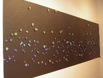 The process by which Vancza arranged the small, jewel like, individual enameled pieces on a black board seemed rather overwrought to me, with hammer sounds translated by some computer process into a sound map that determined the placement of the pieces (image, “B.L.O.B. #8”).
These small drops of color, unlike in the Rice Krispie treat pieces, talk more to the Faberge and jewelry end of the influences spectrum, but I thought the piece a little thin. That the end product was a starry night, however, connected Vancza’s work to the other two artists’.
Steve Cope: Our place in space
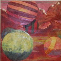 Steve Cope’s own version of the cosmos on canvas is beach balls or striped planets filled with helium, floating in the sky, drifting toward us with a mix of humor and menace. The skies are dramatic, painted in surprising colors (left, “Green Ball, Violet Sky,” 55″ x 55″).
Cope segued into the ball series from a series of blimp paintings, inspired by seeing one floating over Boston harbor from a viewpoint high in a skyscraper. The blimps were, like himself, a “slow, stealthy observer with a great vantage point,” he wrote in his statement.
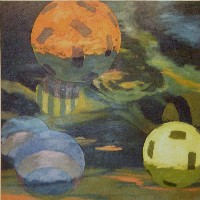 The compositions are strong, the concept of balls or circles floating in the sky open to multiple interpretations, and I as always found the references to the heavens pretty heavenly, but I found the paint-handling just this side of pleasing, the colors just this side of beautiful (right, “Orange Ball”).
Sarah Zwerling: Bleached by moonlight
The music emanating from the installation by Zwerling augmented the spacy drift of Cope’s paintings.
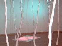 Zwerling’s music–samplings from love songs–had a movie-score sound that evoked Mars and the Moon, but not the honeymoon. Her installation, “Woo,” also included a mood-lit forest of white plastic branches hanging from the ceiling, a white plastic stump topped by a blown-sugar sexy pink flower, and a video of the flower twirling and dancing. I liked the video on the floor of the hot pink sexy flower doing its tango. I liked the white branches, the white stump, the sexy flower, the faux moonlight (left, installation shot including video on floor and branches).
But I couldn’t tie them all together.
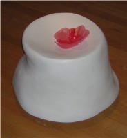 I’m still trying to figure out why the beautifully made white items are white. I suppose they evoke prom decorations in the high school gym and the loss of color in the moonlight. I didn’t see romance, however. The blown sugar in hot pink–a swell technique–works well for the sexy flower on its white stump pedestal–a corsage on a prom dress or a flattened breast, by a great stretch of the imagination (right). But since the music doesn’t evoke its source–pop love songs–the connection of the audio to the visuals is lost. Tell you the truth, I got a little lost in the woods.


