Libby and I charged up to MoMA last week to set eyes on what Charlie Finch described as the “horrible work” of Elizabeth Murray. (See prior post for preamble about Finch.)
And we saw instead paintings that are indeed wonderful.
It’s a show that takes you from her roots in the 1960s and 70s when she’s making minimalist- like line pieces up to the present where the pulled- and stretched- multi-piece canvasses are flattened out into jigsaw puzzles that don’t quite get together. It’s work that’s not easy but is from the heart and the gut, and those are a couple places art should come from.
Libby and I talked our way through the show. We enjoyed our conversation; we enjoyed Murray’s art and, of course, we really enjoyed the idea that Charlie Finch was dead wrong.
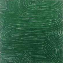
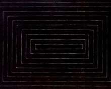
(top, Murray’s pthalo green “Wave Painting” 1973 struck us as a rebuttal to Frank Stella‘s black painting, below — not in the show but we put a detail of it here for point of comparison)
I’ve distilled our conversation into what my notes and my memory can provide. We both will claim this intellectual property.
We saw the influence of Jasper Johns in her early works, one in particular, which had a kind of cartoon target in the center with the letters “A MIRROR” underneath. (sorry no image. In fact you couldn’t take pictures in the exhibition at all so I have relied on the images I found at artnet, some I scanned from the brochure, and the one image I took inside before the guard just about jumped me yelling “No pictures!”)
(image, Frank Stella Black Painting: “Tomlinson Court Park” (second version)1959)
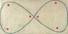
The linear quality of the early work seemed to be talking to minimalism as well as commenting on her life (lines=the prison bars of home — she had small children at the time).
(image is “Mobius Band, 1974)
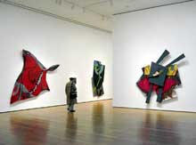
“Don’t Be Cruel” 1986, seemed to be the first torqued canvas piece and it is a doozy. (image left, it’s the red piece on the left).
The jagged blue chasm painted in the middle is nothing compared to the muscular twists of the actual sculpted wood and canvas form which evokes tousled bedsheets and even a kind of undersea skate with a stinger for a tail.
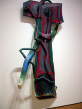
1988 and 1989 were great years for the artist, the works truly vigorous and exotic. “True Air” (right), which struck us as a person with some plumbing problems, is a huge affair and scary with all its references to bodies and buildings and systems maybe not all they should be.
(image right is “True Air” and below is installation shot from artnet showing “Wonderful World” on the left and “True Air” on the right. Look how big they are.)
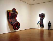
It’s in this part of the show that you want to look close at the making of the pieces because they are truly marvels of twisting wood into undulating shapes and covering the pieces with painted cloth to achieve a kind of trompe l’oeil whole that you accept as whole but know is pieced.
One piece, “Tangled,” sorry no image, reminded us of Neyssa Grassi’s tangles of rope. Even the color was reminiscent — green greys and pink greys and dark blues all suggesting innards and inner turmoil.
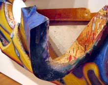
This work on the right (pictured in close-up detail) — and I believe its name is “Things to Come” — was one we looked at closely. It was a pure roller coaster of construction.
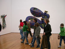
Murray is known for her shoe pieces and “Dis Pair” is one of the more familiar. It sat outside the exhibit proper acting as a kind of loopy advertisement for the show.
While I don’t have any images of this phase of the show, there was an entire room that had as its theme or undertheme sex and the bedroom. “What is Love,” and its peers in the pen-ultimate room were great edgy paintings with angry furniture and lots of things going into and out of other things. Hey, it’s sex painted by a woman. We get why some guys wouldn’t like that.
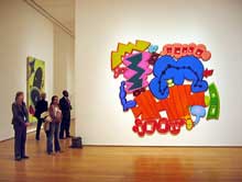
The last room in the show includes the bright-colored works from this century. We called the room the Keith Haring room for truly the colors and the cartoon-like agitation evokes the late grafitti artist. These were not our favorite Murrays. They seem to have a faux-happy quality to them and we prefer it when she’s not pretending to be thrilled to be here — which she is for most of the show in works that are just plain great.
(image is “Bop” 2002-3)


